Trial Rescue: How to Diagnose an Under-Enrolling Study Before You Add More Sites
On this page
Month nine, and the curve has flattened
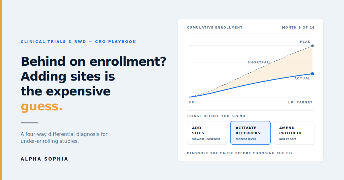
Every clinical operations lead knows the meeting. Nine months into a fourteen-month enrollment window, the cumulative curve that was supposed to be steepening has gone flat. The sponsor wants a recovery plan by Friday. Somebody says the words that get said in every one of these meetings: we need more sites.
It is the most expensive possible response, and it is frequently the wrong one.
Adding sites to a struggling study means new site identification, new contracting, new IRB submissions, new initiation visits, and new monitoring load. Analysis reported in Applied Clinical Trials put site activation cost at roughly $40,000 plus ongoing monthly management. A site added in month nine of a fourteen-month window may enroll its first patient in month thirteen, if at all. You have spent real money to buy almost no time.
Worse, adding sites treats a symptom without diagnosing the cause. If your enrollment shortfall stems from an eligibility criterion that excludes most of your addressable population, twenty more sites will under-enroll in exactly the same proportion. You will have multiplied the problem and called it a solution.
This article lays out an alternative: a structured differential diagnosis you can run in days rather than weeks, using provider-level real-world data to identify which of four distinct failure modes you are actually dealing with, and which intervention that failure mode calls for.
Our existing guides to site selection tools and ICD-10-based site selection cover getting the selection right up front. This article is about what to do when you did not, or when the competitive landscape moved underneath you.
Why enrollment shortfalls get misdiagnosed
The reason “add more sites” wins so many of these meetings is not stupidity. It is that the available evidence at the moment of the meeting points nowhere in particular.
What clinical operations typically has in hand is site-level enrollment counts, screen failure logs, and monitoring visit notes. That tells you which sites are underperforming. It says almost nothing about why. A site enrolling two patients against a target of twelve could be failing for four completely different reasons that demand four completely different responses, and the enrollment count looks identical in all four cases.
Site staff, asked directly, will offer explanations. Those explanations are sincere and systematically incomplete: a coordinator knows what happened inside the clinic, not what happened upstream in the referral pathway or across the street at a competing trial. And there is a reporting bias — no site wants to tell a sponsor that it over-promised at feasibility.
The missing evidence is almost always external to the trial: how many eligible patients actually exist in each site’s catchment, whether those patients are reaching the site at all, and what else is competing for them. That is the gap provider-level real-world data fills.
The four-way differential
Nearly every enrollment shortfall resolves to one of four causes, or a combination. The value of naming them separately is that each has a distinct diagnostic test and a distinct fix — and three of the four are cheaper and faster to address than adding sites.
Cause 1 — The population estimate was wrong
Symptom: Shortfall is uniform across sites. Good sites and weak sites are all missing target by a similar proportion. Screen failure rates are high and cluster around one or two specific criteria.
What happened: The addressable population was over-estimated at feasibility, usually because the translation from protocol language to diagnosis and procedure codes was too permissive. A study that requires biopsy-confirmed disease was sized on all patients carrying the diagnosis code, including those coded on clinical suspicion. The gap between “coded” and “confirmed and eligible” can easily be a factor of three.
How to test it: Rebuild the code set with the medical monitor, this time layering the confirmatory procedure codes and subtracting the common exclusions. Compare the tightened national estimate against the original feasibility number. If the tightened estimate is a fraction of the original, and your actual enrollment rate tracks the tightened number, you have your answer. Our walkthrough of that translation step is in How to Use ICD-10 Data for Clinical Trial Site Selection.
The fix: Protocol amendment, or a re-baselined timeline, or both. Neither is pleasant. But this is the one cause where adding sites genuinely cannot help — you would be adding sites to a population that does not exist at the assumed size.
It is worth being clear-eyed about the cost of that amendment. Tufts CSDD benchmarking published in Therapeutic Innovation & Regulatory Science found that the share of protocols carrying at least one substantial amendment rose from 57% to 76% between 2015 and 2022, with the mean number per protocol climbing about 60% to 3.3. Earlier Tufts work put the median direct cost of a substantial Phase III amendment in the hundreds of thousands of dollars, before counting the timeline impact. Amendments are expensive, common, and — critically — historically driven in large part by recruitment difficulty and eligibility criteria. Diagnosing this cause early is how you make the amendment once rather than twice.
Cause 2 — The sites do not have the patients
Symptom: Shortfall is concentrated. A minority of sites are performing at or above target while a specific subset enrolls almost nothing. Screen failure rates at the weak sites are unremarkable — they are simply not screening many people.
What happened: Site selection was driven by track record, relationships, or self-reported feasibility rather than current patient volume. The institution is real and capable; the patients are somewhere else.
How to test it: Run your tightened code set against each activated site’s associated providers and compare trailing-period diagnosis and procedure volume with actual screening numbers. The pattern is unmistakable when you see it: weak sites show low volume against the codes, and their screening rate is roughly proportional to it. If a site has genuine volume but is not screening, you are looking at Cause 3 or 4 instead.
The fix: This is the one case where adding or substituting sites is the right answer — but now you are doing it with evidence. Identify the high-volume providers and sites of care your original selection missed, prioritize by current volume rather than trial history, and be ruthless about closing sites that will not recover. Closing a non-enrolling site is a real intervention: it stops the monthly management burn and frees monitoring capacity for sites that can use it.
Cause 3 — The patients exist but are not reaching the site
Symptom: Site-associated diagnosis volume looks healthy, but screening numbers do not match it. Site staff report that referrals “dried up” or that they mostly see patients already too far along in their treatment pathway to qualify.
What happened: This is the failure mode that traditional trial oversight is structurally blind to. Patients are being diagnosed in the catchment — by community physicians who have no idea the trial exists — and are being referred somewhere else, or managed locally, or referred to the site’s general clinic rather than to the research team.
How to test it: Map the referral pathways into each underperforming site. Two questions: which providers currently refer into this site, and are there high-volume diagnosing providers in the catchment whose patients flow elsewhere entirely? Referral intelligence reconstructs those pathways from sequenced claims activity, which means you can see the funnel rather than infer it.
The fix: A targeted referring-physician program — and this is usually the fastest available lever in a rescue, because it requires no new contracts, no new IRB submissions, and no new site activations. You are increasing throughput at sites that are already open. Give each underperforming site a named, ranked list of the community physicians who are already diagnosing eligible patients nearby, and support the site in engaging them: a referral pathway, a simple eligibility one-pager, a named contact.
In our experience this is also the most under-used intervention in the industry, largely because until recently the data to do it precisely did not exist. Without referral data, “engage referring physicians” means handing sites a specialty list and hoping. With it, it means handing a site fifteen specific physicians ranked by how many eligible patients they are currently managing.
Cause 4 — The patients exist, reach the site, and go elsewhere
Symptom: Volume is there, referrals are there, screening is happening, and enrollment still lags. Or the site reports that eligible patients are being enrolled into a different study.
What happened: Competitive saturation. Your PI is running three protocols in the same indication and yours is not the one they reach for first — because of enrollment incentives, because another protocol has looser criteria, or simply because it started earlier and has momentum.
How to test it: Check the current trial load of your PIs and the competitive landscape in each catchment. Cross-reference active investigator roles against public registrations on ClinicalTrials.gov and look at where competitor engagement is concentrated. Open Payments relationships add useful signal about which sponsors are already deeply engaged with a given investigator.
The fix: Rarely a data problem at that point — it is a site relationship and study-design problem. But knowing it is the cause changes the conversation entirely. You stop asking the site to try harder and start asking whether the study needs different sites, a different sub-investigator at the same institution, or a competitive positioning change. Frequently the answer is to shift effort toward trial-naive high-volume sites with no competing load, which is a distinct and identifiable segment.
Running the diagnosis: a five-day triage
The framework above is only useful if it can be executed faster than the problem compounds. Here is the sequence, and it is genuinely a week of work rather than a month.
Day 1 — Rebuild the code set. Sit down with the medical monitor and rebuild the ICD-10 and CPT definition from the current protocol, including amendments. Layer in confirmatory procedures and subtract the top three exclusion criteria. You are producing a tighter, more honest definition of the addressable population than the one used at feasibility.
Day 2 — Re-size and re-baseline. Run the tightened code set nationally and by site catchment. Compare against the original feasibility estimate. This single comparison tells you immediately whether Cause 1 is in play, and it is the most consequential fork in the road because it is the only branch that leads to a protocol conversation.
Day 3 — Score the activated sites. For every open site, pull trailing-period volume against the tightened codes for the providers associated with that site of care. Plot volume against actual screening. Sites in the low-volume, low-screening quadrant are Cause 2. Sites in the high-volume, low-screening quadrant are Cause 3 or 4.
Day 4 — Map referrals for the high-volume, low-screening sites. For each, identify existing referrers and, more importantly, high-volume diagnosing providers in the catchment whose patients are going elsewhere. This produces your referral activation target list.
Day 5 — Check competitive load and assemble the recommendation. Review PI trial load and competitive activity for any site still unexplained. Then write the recovery plan as a set of causes with matched interventions, not as a single blanket action.
The output the sponsor receives is qualitatively different from the usual recovery memo. Instead of “we propose adding fifteen sites,” it reads: eight sites are Cause 3 and get referral activation programs starting in two weeks; five sites are Cause 2 and will be replaced with named high-volume alternatives; three sites are Cause 4 and we recommend closing; and the tightened population estimate suggests the timeline needs to move by six weeks regardless.
Matching the intervention to the cause
| Cause | Diagnostic signal | Primary intervention | Time to impact |
|---|---|---|---|
| Population over-estimated | Uniform shortfall, high screen failure on specific criteria | Protocol amendment or re-baselined timeline | 3–6 months |
| Sites lack patient volume | Concentrated shortfall, low screening, low coded volume | Replace or add sites selected on current volume | 3–5 months |
| Referral funnel missing | Healthy coded volume, low screening | Targeted referring-physician activation | 4–8 weeks |
| Competitive saturation | Volume and referrals present, enrollment still lags | Site relationship reset, sub-investigator change, or reallocation to naive sites | 6–12 weeks |
The time-to-impact column is the part worth sitting with. Referral activation is not merely cheaper than adding sites — it is the only intervention on the list that can move the curve inside a quarter. In a rescue, that difference is often the whole game.
Worked example: a Phase III lupus nephritis program
Consider a CRO running a Phase III lupus nephritis study for a mid-cap sponsor. Target: 320 patients across 55 US sites over 16 months. At month ten, enrollment stands at 41% of plan. The sponsor has asked for a recovery proposal.
The reflexive plan. Add 20 sites, prioritizing academic nephrology and rheumatology centers with lupus trial history. Estimated cost, well over $1M in activation and management; estimated first patient from a new site, month fifteen.
The triage.
Code set rebuild. M32.14 for glomerular disease in systemic lupus, layered with renal biopsy procedure codes, because the protocol requires biopsy-confirmed Class III/IV/V disease. The original feasibility model had been sized on the broader M32 family. The tightened estimate comes in at roughly 40% of the original — the first and most important finding, and it partially explains the shortfall by itself. Cause 1 is confirmed as a contributor.
Site scoring. Against the tightened code set, 34 of 55 sites show solid volume. Eleven show almost none — these were selected on lupus trial history rather than current nephritis volume, and several are academic centers whose lupus nephritis patients now flow to a different affiliated institution after a network reorganization. Cause 2, eleven sites.
Referral mapping. Of the 34 high-volume sites, 19 are screening well below what their catchment volume supports. Referral mapping shows a consistent pattern: community rheumatologists are diagnosing and managing these patients, and referring to nephrology only at the point of significant renal decline — by which time many patients fail eligibility. The trial is fishing at the wrong point in the pathway. Cause 3, nineteen sites, and the single largest recoverable pool.
Competitive load. Of the remaining sites, four have PIs carrying two or more competing lupus nephritis protocols. Cause 4.
The proposal. Rather than 20 new sites: a referring-rheumatologist activation program across the 19 Cause 3 sites, each receiving a ranked list of roughly 12 to 20 community rheumatologists in their catchment with current diagnosing volume, plus an early-referral eligibility card designed around the biopsy timing problem. Eleven Cause 2 sites closed or replaced with eight named high-volume alternatives. Four Cause 4 sites addressed through sub-investigator changes. And an honest conversation with the sponsor about the population estimate, with a proposed amendment to the biopsy-timing window that the referral data independently supports.
The cost is a fraction of the reflexive plan. More to the point, the largest component — referral activation — starts producing screening within weeks rather than quarters, because it works through sites that are already open.
Measuring whether the rescue is working
Rescue plans have a habit of being declared successful because everyone wants them to be. Instrument yours.
-
Screening rate by site, weekly — the leading indicator. Enrollment lags screening by weeks; if screening is not moving within a month of a referral activation program, the intervention is not landing.
-
Referral-sourced screening share — of patients screened at Cause 3 sites, what proportion came through the newly activated referrers. This is the direct test of whether the program works.
-
Screen failure rate, before and after — if it rises sharply after referral activation, your eligibility one-pager is not doing its job and referrers are sending the wrong patients.
-
Catchment volume capture — screened patients as a share of estimated eligible volume in each site’s catchment. This normalizes for the fact that sites have genuinely different addressable populations.
-
Cost per enrolled patient by intervention type — track referral activation against site addition separately. Two studies of this data will settle the internal argument permanently.
-
Time from intervention to first incremental patient — the number that justifies the approach to the next sponsor.
The one to watch hardest is referral-sourced screening share. If it stays near zero after four to six weeks, the problem is usually execution rather than analysis: the site received a list and did nothing with it. Referral activation is a relationship program that data makes precise; the data alone does not make the calls.
The cheaper version of all of this
Everything above is remedial. The same analysis, run at feasibility rather than at month ten, costs a fraction as much and prevents most of what it later diagnoses.
The Cause 1 error — sizing on a loose code set — is entirely preventable with a careful translation step. The Cause 2 error is prevented by selecting sites on current diagnosis and procedure volume rather than trial history. The Cause 3 gap is prevented by mapping referral pathways into candidate sites during selection, so you know a site’s realistic ceiling before you activate it. And Cause 4 is prevented by screening PI competitive load at selection, which almost nobody does systematically.
That prospective version of this workflow is set out step by step in our companion article on clinical trial site selection, alongside a wider look at how the RWD, investigator-database, and eClinical layers fit together. For the underlying data architecture, see How Unified Provider Data Powers Commercial and Research Use Cases and, if you are embedding this into internal feasibility tooling rather than running it manually, the Alpha Sophia Provider API FAQ.
For CROs, there is a commercial argument here as well as an operational one. Rescue capability is a service line, and a differentiated one. An organization that can walk into a struggling program with a five-day diagnostic framework and a cause-matched recovery plan is selling something materially different from an organization that can supply more sites.
Closing
The instinct to add sites when enrollment lags is understandable. It is visible, it is decisive, and it reassures a sponsor that action is being taken. It is also, in three of the four common failure modes, an expensive way to avoid the diagnosis.
Enrollment shortfalls have causes, those causes leave distinguishable signatures in real-world data, and the interventions they call for differ by an order of magnitude in both cost and speed. Spending a week finding out which one you have is the highest-return week available in a struggling study.
Running a study that is behind plan? Book a demo and we will run the site-level volume and referral diagnosis against your protocol.
Frequently asked questions
Should we ever add sites to a struggling trial?
Yes, but only for one of the four causes: when the diagnosis shows your activated sites genuinely lack patient volume against a correctly tightened code set. In that case adding or substituting sites is the right intervention, and provider-level volume data lets you choose replacements on current diagnosing activity rather than trial history. What to avoid is adding sites as a default response before establishing which cause you are dealing with, because in the other three scenarios it multiplies cost without addressing the constraint.
How long does the diagnostic triage take?
About a week for a typical Phase III study of 40 to 80 sites, assuming the medical monitor is available for the code set rebuild on day one. The code set step is the bottleneck and the one worth not rushing, because every subsequent analysis inherits its assumptions. Organizations that have run the process before, or have it wired into internal tooling through an API, can compress it further.
What if our enrollment shortfall has more than one cause?
It usually does, and the framework is built for that. A typical rescue finds a partial population over-estimate plus a cluster of low-volume sites plus a larger cluster of referral gaps. The value of separating them is that each subset gets the intervention it actually needs, rather than a single blanket action applied to sites with different problems. The site-scoring step in the triage assigns each open site to a cause, so the recovery plan is segmented from the start.
Why is referring-physician activation faster than adding sites?
Because it requires no new contracts, IRB submissions, site initiation visits, or activation costs. You are increasing patient throughput into sites that are already open and already screening. The work is identifying which specific community physicians in each catchment are currently managing eligible patients, and then supporting the site in building a referral relationship with them. First incremental screenings typically appear within four to eight weeks, against three to five months for a newly activated site.
How do you identify which physicians to target for referral activation?
By mapping referral pathways into the underperforming site from sequenced claims activity, then identifying high-volume diagnosing providers in the catchment whose patients currently flow elsewhere or are managed locally. Those providers are ranked by trailing-period volume against your tightened code set. The output is a named, ranked list per site rather than a specialty-wide mailing list, which is what makes the program executable for site staff who have limited time.
Can this be done without pausing the study?
Yes. The entire diagnostic runs on external real-world data and your existing site-level screening and enrollment records. It requires no protocol change, no site burden, and no interruption to ongoing recruitment. Only one of the four causes leads to a protocol amendment conversation, and that conversation is better had with the analysis in hand than without it.
We suspect our eligibility criteria are the problem. Does this help build the case for an amendment?
It helps considerably. The tightened code set analysis quantifies the gap between the population implied by the original feasibility estimate and the population your actual criteria address, which is the core evidence any amendment discussion needs. It can also isolate which specific criterion is doing the damage, by modelling the addressable population with and without the confirmatory procedure or timing requirement in question. That turns a qualitative argument into a sized one.
Does the approach work for rare disease trials?
It works, with a caveat. In rare indications the absolute volumes are small enough that individual coding practices introduce meaningful noise, so treat the site-level volume numbers as directional rather than precise. The referral mapping component is often more valuable in rare disease than in common indications, because rare disease patient pathways are long, involve multiple referring specialists, and are poorly understood by the trial sites at the end of them.
How does this differ from what our CTMS or feasibility vendor already provides?
A CTMS records what happened inside your study: screening, enrollment, visits, deviations. It tells you which sites are underperforming with high accuracy and says nothing about why, because the cause is almost always external to the trial. Provider-level real-world data supplies that external context: how many eligible patients exist in each catchment, whether they are reaching the site, and what else is competing for them. The two are complementary, and the diagnosis requires both.
What is the fastest way to validate this approach internally?
Run it retrospectively against a study that under-enrolled. Rebuild the code set from the real protocol, score the sites as they existed, map the referral pathways, and check whether the framework would have assigned the correct cause to the sites that actually failed. It takes a few days and produces an internal answer rather than a vendor claim, which is a far better basis for deciding whether to build it into standard feasibility practice.
Related reading
