Why Clinical Trials Miss Enrollment Targets: A Q&A on the Site Selection Problem
On this page
Enrollment shortfalls are the most expensive recurring problem in clinical development, and the one most often explained away rather than diagnosed. This piece works through the problem space in question-and-answer form: where patients are actually lost, why the standard feasibility process keeps producing optimistic numbers, and what real-world data can and cannot tell you about it.
It is written for clinical operations, feasibility, and business development teams at CROs and pharma services organizations. It is deliberately about the problem rather than any particular solution — the practical workflows are covered elsewhere and linked where relevant.
Where the losses actually happen
How common is site under-enrollment, really?
Common enough that it is a structural feature of the industry rather than an occasional failure. Research from the Tufts Center for the Study of Drug Development has repeatedly found that roughly one in ten activated investigative sites never enrolls a single patient, with a much larger share — historically somewhere between a third and a half — enrolling below target. More recent Tufts work benchmarking site activation and enrollment across 2012, 2019, and 2023 shows aggregate enrollment achievement has improved, which is genuinely good news. What has not improved much is the variance. The average site got better; the spread between the best and worst sites in a given study did not narrow correspondingly, which means the planning problem is largely unchanged.
Is that a site quality problem or a site selection problem?
Mostly selection. A site that enrolls two patients against a target of twelve is usually not incompetent — it is frequently a well-run institution that was asked to recruit from a patient population it does not actually see, or that sees those patients at a point in the care pathway where they no longer qualify.
The distinction matters because it changes where you invest. If the problem is site quality, you invest in monitoring, training, and site support. If the problem is selection, none of that helps: you have optimized the wrong sites. Most of the industry’s remediation spending assumes the first explanation while the evidence points at the second.
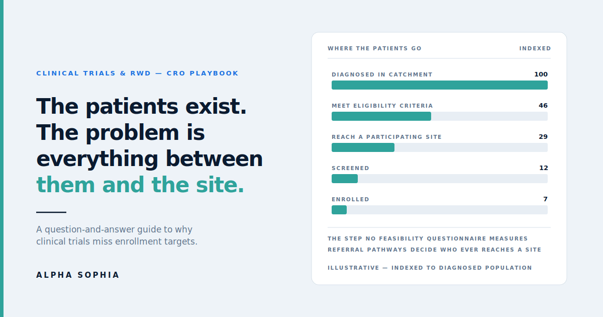
What does the attrition actually look like, from diagnosed population to enrolled patient?
There are four distinct narrowing steps, and teams tend to model only two of them.
The first is eligibility: of everyone carrying the diagnosis in a catchment, some fraction meets inclusion and exclusion criteria. Feasibility models this, though usually optimistically.
The second is access: of the eligible patients, some fraction is actually managed by, or referred to, a participating site. This is the step almost nobody models, and it is frequently the largest single loss. A patient who is eligible but whose care pathway never intersects a trial site is invisible to every system you have.
The third is screening: of the patients who reach a site, some fraction gets identified and approached. This depends on site staffing, competing protocols, and how well the research team is integrated with the clinical team.
The fourth is conversion: of those screened, some fraction consents and passes screening. Sites track this well.
The industry has good instrumentation on steps three and four, because they happen inside the trial. It has weak instrumentation on step one and almost none on step two — which is precisely where the largest and least visible losses occur.
Why is the access step so invisible?
Because nothing in the standard trial apparatus can see it. A CTMS records what happens inside your study. A site coordinator knows what walks through their clinic door. Neither can tell you about the eligible patient forty minutes away whose community physician manages them locally, or refers them to a different institution entirely.
Seeing that step requires data about patient flow across the health system, independent of your trial — which means claims-derived referral pathways rather than anything generated by the study itself. That is a category of data most feasibility processes have never had access to, so the step got treated as noise rather than as a variable.
Why feasibility keeps producing optimistic numbers
Why do feasibility questionnaires over-estimate?
Three reasons compound.
First, sites are asked to estimate a number they do not measure. Very few clinics can query their own population against a specific set of inclusion criteria, so the answer is an informed guess made under time pressure.
Second, incentives point one direction. A site that estimates conservatively risks not being selected. There is no penalty for optimism at the questionnaire stage and a clear cost to pessimism.
Third, and most underrated, sites estimate their total relevant patient population and then mentally apply an eligibility discount that is almost always too small. The gap between patients carrying a diagnosis and patients meeting a full protocol’s criteria is routinely a factor of two or three, and it widens with protocol complexity.
None of this is dishonesty. It is a structural feature of asking someone to self-report a number they cannot measure, in a process where optimism is rewarded.
What is wrong with selecting sites on trial track record?
Track record is a real signal about operational capability — whether a site can run a study competently, meet timelines, and produce clean data. It is a poor signal about current patient availability, for two reasons.
It is retrospective. A site that enrolled well for a 2022 study tells you about that site’s patient flow and competitive environment in 2022. Health system reorganizations, referral pattern shifts, and physician moves all change that picture faster than most people assume.
And it is self-selecting. Sites with track records are, by definition, sites that other sponsors also identified. In a crowded indication, prior experience correlates with current competitive saturation — the very sites your track-record filter surfaces are the ones already carrying three competing protocols.
Why does the diagnosing physician matter if they are not the investigator?
Because they control whether a patient ever becomes available to the trial at all.
In most indications, the physician who first diagnoses a patient is not the physician at the trial site. A community rheumatologist, a general cardiologist, a primary care physician ordering the first labs — these people sit at the top of the funnel. Whether a patient reaches a participating site, and at what point in their disease course, is largely determined by referral behavior upstream.
This has a second-order effect that catches teams out: referral timing determines eligibility as much as referral destination. If community physicians typically refer only once a patient has deteriorated past a certain point, and your protocol excludes patients at that stage, then a site can have excellent referral inflow and still see almost no eligible patients. The funnel is not just leaky, it is arriving late.
How much of the enrollment problem is protocol design rather than site selection?
A substantial share, and the two interact. Protocol complexity has risen steadily, and every added criterion narrows the eligible population, usually by more than the design team estimates.
The interaction shows up in amendments. Tufts CSDD benchmarking published in Therapeutic Innovation & Regulatory Science found the share of protocols carrying at least one substantial amendment rose from 57% to 76% between 2015 and 2022, with the mean number per protocol climbing about 60% to 3.3. Historically, recruitment difficulty and eligibility criteria have been among the most common triggers for amending a protocol.
The practical reading: an enrollment shortfall attributed to “bad sites” is frequently a protocol problem that surfaced late, because nobody sized the addressable population against the actual criteria before activating anyone.
What the data can and cannot tell you
What can claims data show that a feasibility questionnaire cannot?
Three things a site cannot self-report.
Independent volume. Which physicians are diagnosing and treating the target condition, at what volume, in the trailing period — measured rather than estimated. Layering procedure codes onto diagnosis codes tightens this considerably, because it separates physicians running a real workup pathway from those recording a diagnosis incidentally. See our overview of how US healthcare claims data licensing works for how these feeds are sourced.
Patient flow. Which physicians refer to which institutions, and in what volume — reconstructed from claims sequencing. This is the only practical way to observe the access step described above. More on the mechanics in Referral Intelligence.
Competitive context. Which investigators are currently carrying trial load, and where industry engagement is concentrated.
What are the honest limits of claims-based estimates?
Worth being direct about these, because overselling them is how the approach loses credibility.
Claims reflect what was billed, not what is clinically true. Coding practices vary between physicians and institutions, and a diagnosis code is a billing artifact rather than a confirmed diagnosis. There is a lag between service and adjudication, so figures describe a trailing period rather than today. Claims contain no lab values, no vitals, no imaging findings, and no clinical notes — so any criterion that depends on those is invisible. And in rare indications, absolute volumes get small enough that individual coding idiosyncrasies introduce meaningful noise.
What claims do well is measure activity and flow at scale across the full provider universe. What they cannot do is confirm clinical eligibility for a specific protocol. Treating a claims-derived number as an eligibility count rather than a directional volume signal is the most common way teams misuse it.
How is ICD-10 volume different from eligible patient volume?
They are separated by every inclusion and exclusion criterion in the protocol, and the gap is usually large.
The practical discipline is to build the code set as tightly as the protocol allows — using sub-codes rather than code families, layering in confirmatory procedure codes where eligibility depends on a procedure or test, and building a negative code set for the most common exclusions. A query built on a whole ICD-10 family when the protocol specifies a sub-type can inflate the addressable population several-fold.
Even done well, the result is a defensible upper bound and a relative ranking between geographies and physicians, not an eligible-patient count. Our walkthrough of that translation step is How to Use ICD-10 Data for Clinical Trial Site Selection.
Where do EHR-based cohort platforms fit?
They answer the eligibility question that claims cannot. Platforms such as TriNetX query federated EHR networks and can model criteria involving labs, vitals, and clinical detail — which is exactly the gap in claims data.
What they see less well is the full provider universe and the flow between providers, because their view is bounded by the institutions in the network. The two data types are complementary rather than competing: cohort platforms are strongest for “do enough eligible patients exist,” claims-derived provider data is strongest for “which physicians control access to them and how do patients move.” Teams that use both, and understand which question each is answering, get materially better feasibility estimates than teams that pick one.
A wider map of how these categories fit together — including investigator databases such as Citeline and eClinical platforms such as Medidata — is in Essential Tools for CROs and Clinical Trial Site Selection.
What it costs to get this wrong
What does a non-enrolling site actually cost?
More than most budgets acknowledge, because the cost is spread across categories. Analysis reported in Applied Clinical Trials modeled site activation at roughly $40,000 plus ongoing monthly management, which over a long study produces a per-patient cost for a single-patient site that is an order of magnitude worse than a high-performing one.
The direct spend is only part of it. A non-enrolling site consumes monitoring visits, contract and regulatory effort, and project management attention that could have gone to sites capable of using it. In a study with a fixed monitoring budget, every underperforming site is a tax on the ones that are working.
How do enrollment delays translate into program cost?
Through the timeline, which is where the real money sits. Enrollment is typically the longest single phase of a late-stage study, and delay there pushes every downstream milestone — database lock, analysis, submission, and ultimately market entry.
That is why enrollment shortfalls tend to be escalated as commercial problems rather than operational ones. The activation cost of fifteen underperforming sites is a rounding error next to a two-quarter delay to a pivotal readout.
Why do enrollment problems so often turn into protocol amendments?
Because when a study is behind and the site network cannot be fixed quickly, loosening eligibility is one of the few levers that acts on the whole study at once.
It is also expensive and slow. An amendment requires internal approval, ethics or regulatory review, site re-training, and frequently participant re-consent, and it resets timelines it was meant to protect. The Tufts data cited above shows amendments have become both more common and more numerous per protocol.
The uncomfortable implication is that a meaningful share of amendment spending is remediation for a feasibility estimate that was never pressure-tested against the actual criteria. That is a diagnosable, and preventable, category of cost.
What changes when teams fix it
What does a data-led selection process actually change in practice?
Four things, in rough order of impact.
The population estimate becomes defensible rather than aspirational, because it is built from measured provider activity against a tightened code set rather than from summed site self-reports.
Site selection shifts from institutional reputation to current patient volume, which surfaces high-volume community practices and regional health systems that track-record filters never see.
The access step becomes visible. Instead of hoping patients arrive, teams can see which physicians feed a candidate site and which high-volume physicians are sending patients elsewhere entirely.
And investigator assessment starts accounting for competing trial load, which is probably the single most under-weighted variable in the entire process.
Is this only relevant to large CROs?
No, and arguably the leverage is greater for smaller organizations. A large CRO has an internal site database built over decades, which is a genuine asset even with the retrospective limitations described above. A mid-sized CRO competing against that has to differentiate on analysis rather than accumulated relationships — which is exactly what a quantified population map and a referral-backed site architecture provide in a bid defense.
The same applies beyond CROs. Site identification and patient recruitment vendors use the same evidence to build recruitment networks; site management organizations use it to evaluate acquisitions and affiliations. The underlying question — where are the patients and who controls access to them — is the same in each case.
Where should a team start?
With a retrospective test rather than a process change. Take a study that under-enrolled, rebuild the code set from the real protocol, and check whether measured provider volume in each site’s catchment would have predicted which sites failed. It takes a few days and settles the internal argument with your own data rather than a vendor’s claim.
If it does predict, the follow-on question is where the analysis lives. Running it manually per study works but does not compound; embedding it in feasibility tooling does. Both routes are covered in How Unified Provider Data Powers Commercial and Research Use Cases and What Changes When Healthcare Data Becomes Truly System-Ready.
The short version
Enrollment shortfalls are usually not a site quality problem. They are the accumulated result of an eligibility estimate that was never tested, a selection process that optimizes for past participation rather than current patient volume, and an access step between eligible patients and participating sites that the standard toolkit cannot see.
All three are measurable. None of them is measured by the process most teams still run.
Want to test this against one of your own studies? Book a demo and we will run the provider volume and referral analysis against a protocol you have already completed.
Related reading
